Design af logoer til bands
Band logoer til metal bands designet af Ian Ibæk Møller
Jeg søger at indfange bandets essens og stemning i logoet. For eksempel afspejler Saturnus' logo den melankolske og atmosfæriske doom metal-genre, mens Uurros' logo formidler den rå intensitet af black metal.
Med en baggrund i illustration og grafisk design kombinerer jeg håndtegnede skitser med digitale teknikker. Jeg arbejder tæt sammen med bandet for at sikre, at logoet afspejler deres unikke identitet og musikalske stil.
Resultatet er et logo, der ikke blot er visuelt tiltalende, men også fungerer som en forlængelse af bandets musik og image. Det bliver en genkendelig signatur, der skaber forbindelse mellem bandet og deres publikum.
Design af Bandlogoer:
Skab det Perfekte Visuelle Udtryk
Et bandlogo er mere end blot en visuel identitet – det er et symbol på bandets musik, stil og energi. Et godt designet logo kan være afgørende for, hvordan et band opfattes og genkendes af fans og musikbranchen. Her er nogle vigtige overvejelser, når man designer et bandlogo.
1. Kend Bandets Identitet
Før du begynder at designe, er det vigtigt at forstå bandets genre, budskab og image. Et metalband vil typisk have et mørkere og mere aggressivt logo, mens et popband kan have et mere farverigt og legende udtryk. Logoet skal afspejle musikkens stemning og skabe en stærk visuel forbindelse til bandets lyd.
2. Enkelhed og Genkendelighed
Et effektivt bandlogo bør være simpelt nok til at være let genkendeligt, selv i små størrelser. Mange ikoniske bandlogoer som Metallicas lyn-skrift eller Rolling Stones’ tunge er nemme at huske og gengive. Undgå for komplekse detaljer, der kan gå tabt i forskellige formater.
3. Valg af Skrifttype
Typografien spiller en central rolle i logoets udtryk. Håndtegnede skrifttyper kan give et unikt og autentisk udtryk, mens klassiske og skarpe skrifttyper kan signalere professionalisme. Overvej, om bogstaverne skal være letlæselige eller mere kunstneriske afhængigt af målgruppen.
4. Farvevalg
Farver vækker følelser og skaber associationer. Sorte og mørke nuancer bruges ofte i rock og metal, mens lyse og stærke farver kan fungere godt til pop og elektronisk musik. Overvej også, hvordan logoet ser ud i sort/hvid, da det ofte vil blive brugt i forskellige medier.
5. Symboler og Ikoner
Mange bands vælger at inkludere et ikon eller en grafisk detalje i deres logo, som kan stå alene og stadig repræsentere bandet. Dette kan være en enkel illustration, et abstrakt symbol eller elementer, der er tæt forbundet med bandets navn eller musikalske univers.
6. Fleksibilitet og Anvendelse
Et godt bandlogo skal kunne anvendes på tværs af forskellige platforme – fra albumcovers og merchandise til plakater og sociale medier. Sørg for, at logoet fungerer både i farve og sort/hvid samt i forskellige størrelser uden at miste sin effekt.
Konklusion
Design af et bandlogo kræver en balance mellem kreativitet og funktionalitet. Det skal være unikt, genkendeligt og afspejle bandets musikalske identitet. Ved at fokusere på enkelhed, passende typografi, farver og fleksibilitet kan du skabe et logo, der ikke bare repræsenterer bandet visuelt, men også styrker dets brand og tiltrækker nye fans.
Rachel Davies
Designet i 2023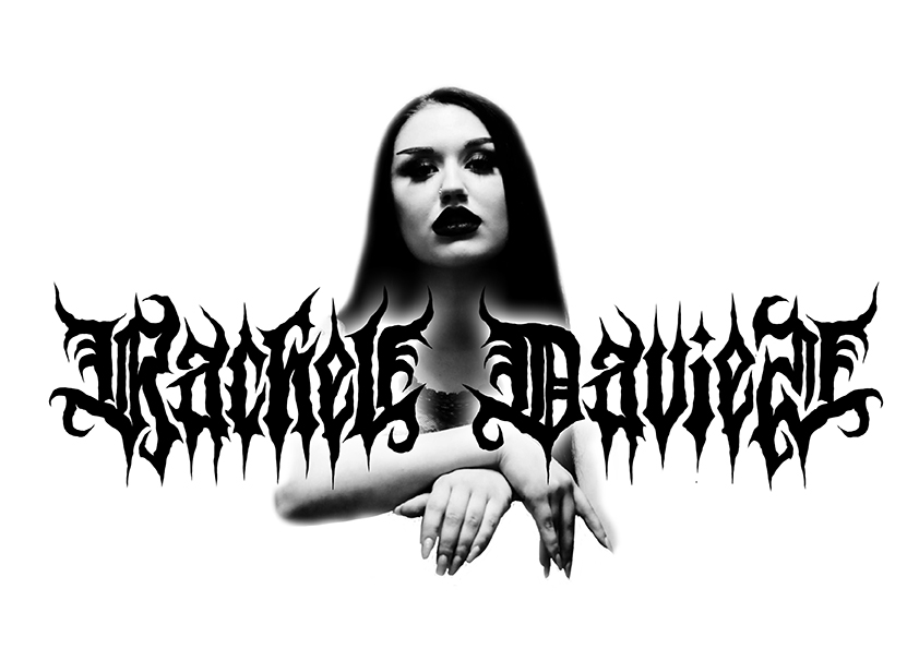
Uurros
Designet i 2021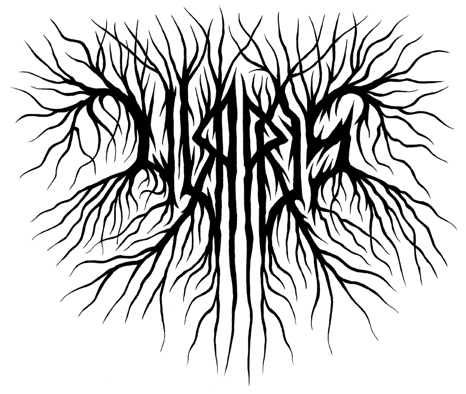
Saturnus
Designet i 1996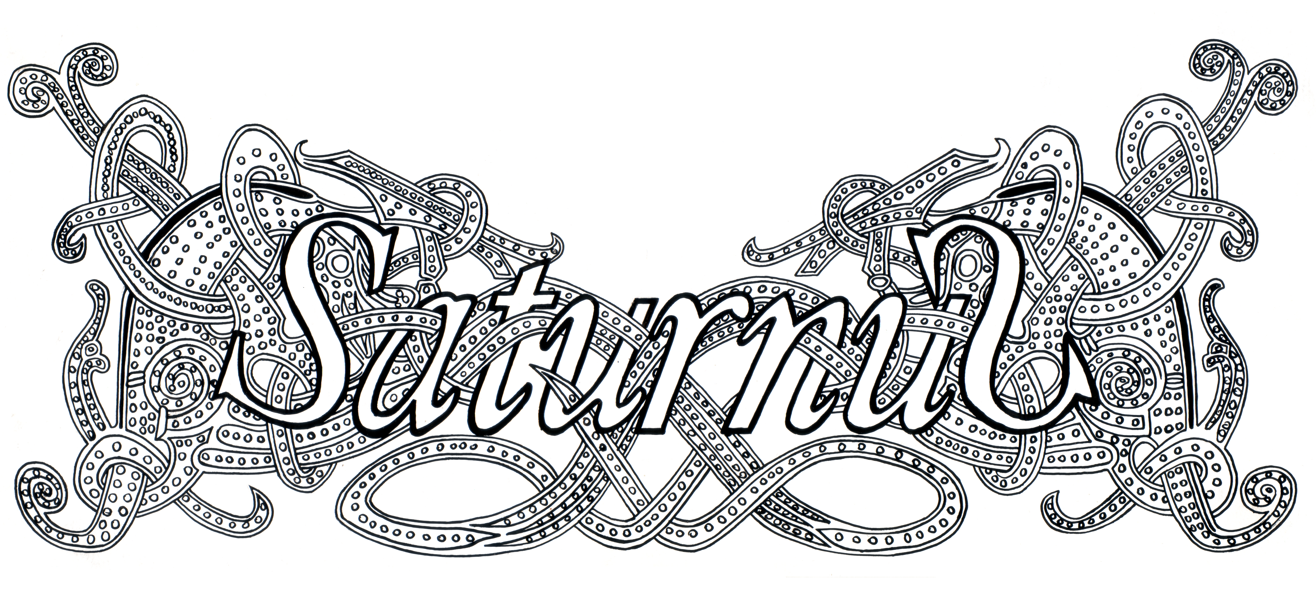
Sigrulfr
Designet i 2010 af Ian Ibæk Møller.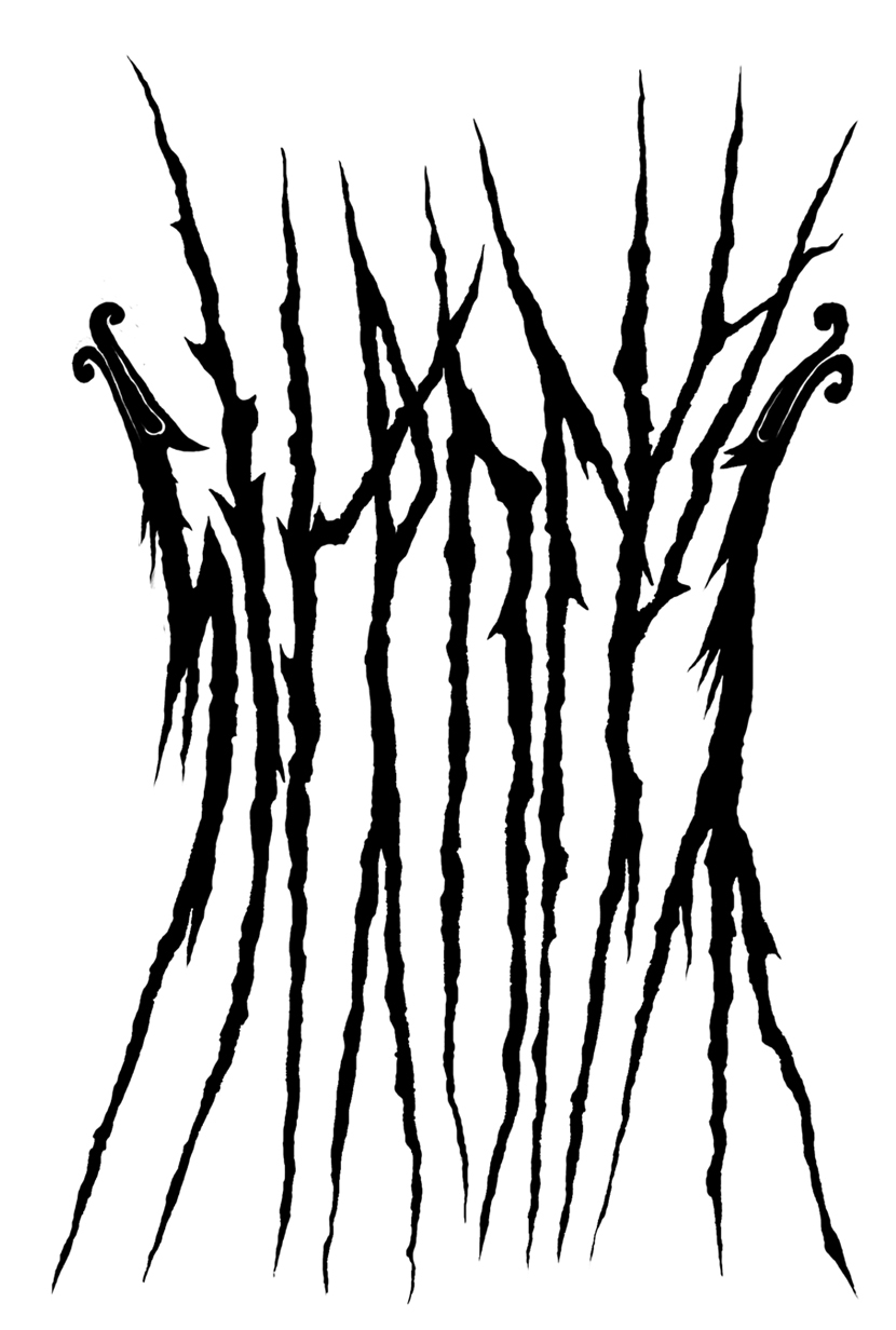
Mok Nok
Designet i 2005